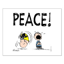
By Nofrillsart of Redbubble community
By PixelProtest of Redbubble
Building forms out of words, letters or elements is a fairly common design conceit. Indeed, the lettering builds on an old technique of using letterforms as frames-or reveals-for the image. Based on a similar approach, all featured visuals illustrate the playfulness of graphic design and share common traits.
All of the 3 designs on top are type-based, which bring each visual to life, while achieving a recognisable shape.
All of the 3 designs on top are type-based, which bring each visual to life, while achieving a recognisable shape.
The typography graphically spells out meaning and takes on greater significance.
A for the visual below, it's the elements (grenades & M16) that playfully represent the message and celebrate the idea.
By PixelProtest


2 comments:
Its pretty good. I like very simple and different type of Posters. I like using such pictures only for my Business advertisement.
This gun poster looks really cool and creative i like this post.
Thanks.
Nice blog.
Post a Comment